In the crowded business world, having a standout business card is essential for making a lasting impression. Start by understanding that your card isn’t just about sharing contact details; it communicates your brand’s identity and message. Choosing the right size and unique shape can draw attention, while high-quality materials add to its appeal. It’s important to select fonts that are both stylish and legible, keeping typography simple and ensuring there’s enough white space to prevent clutter. Don’t forget a call to action! Overall, balance creativity with professionalism for a memorable impact that resonates with potential clients.
Understand the Purpose of Your Business Card
A business card is more than just a piece of paper with your contact details; it is a marketing tool that conveys your brand message. It serves as a tangible reminder of your interaction with potential clients, partners, or customers. For instance, when you hand out your card at a networking event, it should evoke a sense of professionalism and trust. This means that every element, from the design to the information included, should be intentionally chosen to reflect your brand’s identity and values. A well-thought-out card can spark conversations and create opportunities, making it essential to align your card with your overall branding strategy.
Choose the Right Size and Shape
The standard size for a business card is 3.5 x 2 inches, which fits neatly into wallets and cardholders. However, to make a lasting impression, consider opting for a unique size or shape. For example, square cards (2.5 x 2.5 inches) or cards with rounded corners can add a modern twist. A vertical orientation can also catch the eye, creating curiosity. Just ensure that the size you choose allows all necessary information to be clearly displayed without feeling cramped. Remember, the goal is to stand out while still being practical.
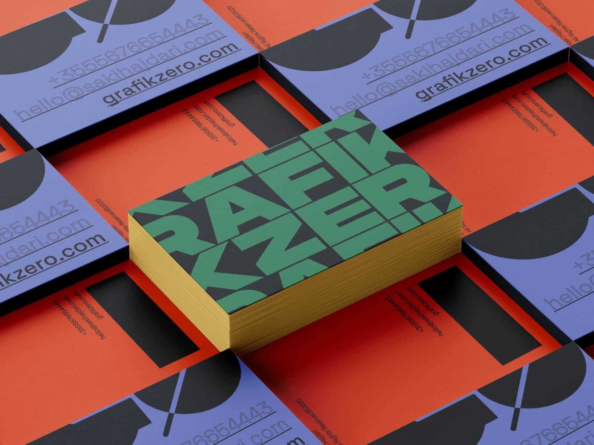
Select Quality Materials
The material of your business card speaks volumes about your brand. Selecting high-quality materials can significantly enhance the overall impression of your card. Opt for a thicker cardstock, ideally between 14pt to 16pt, which not only feels substantial in hand but also conveys a sense of professionalism and attentiveness to detail.
Consider unique finishes to set your card apart. A matte finish provides a sophisticated look, while a glossy finish can make colors pop and attract attention. Textured cardstocks can add a tactile dimension that engages recipients. Additionally, special features such as foil accents or embossing can create a striking visual impact, making your card memorable. For instance, a simple gold foil logo can elevate a standard design into something luxurious and eye-catching.
Remember, the choice of materials should align with your brand identity. For a creative business, vibrant colors and unique textures might be appropriate, while a corporate entity might opt for classic designs with a sleek finish. In either case, investing in quality materials ensures that your business card not only stands out but also reflects the standard of your services.
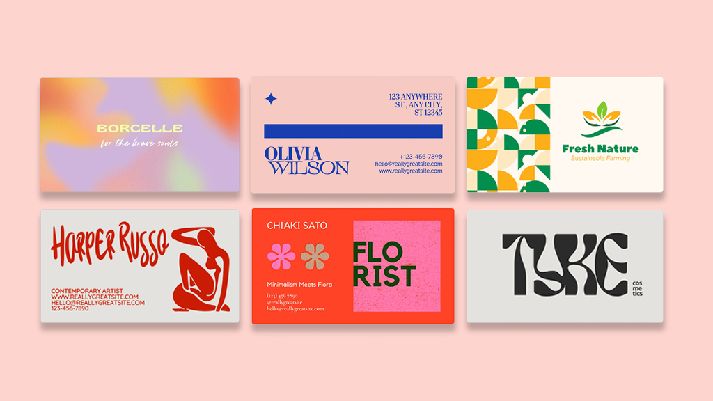
Design with Your Brand in Mind
 Credits: logoai.com
Your business card should reflect your brand’s personality. Start by using your brand’s color scheme and logo prominently on the card. For example, if your brand is known for its vibrant colors, incorporate those hues into your design to create a cohesive look. This consistency helps with brand recognition, making it easier for people to remember you. If your brand has specific fonts, utilize them on your card to maintain uniformity throughout your marketing materials. Additionally, consider the overall tone of your brand—if it’s professional and sleek, your card should mirror that with a minimalist design; if it’s quirky and fun, don’t hesitate to include playful elements. Ultimately, your business card is a first impression, so ensure it communicates who you are and what you stand for.
Organize Your Information Effectively
To create a business card that stands out, it’s essential to organize your information clearly and logically. Start by placing your name and job title at the top, as these are the most important details. Next, include your company name and logo, which helps to reinforce your brand identity. Follow this with your contact details, such as your phone number, email address, and website. If your business has a presence on social media, you can include those handles, but keep them concise to avoid clutter. Make sure to prioritize the information so that the most critical elements are easily visible. For example, if you are a freelancer, your name should be more prominent than your social media links. This thoughtful arrangement ensures that recipients can quickly find the information they need without feeling overwhelmed.
| Information Type | Details | Importance |
|---|---|---|
| Name | Your Full Name | High |
| Job Title | Your Job Title | High |
| Company Name | Your Company’s Name | High |
| Contact Number | Your Phone Number | High |
| Email Address | Your Email Address | High |
| Website | Your Company Website | Medium |
| Social Media Handles | Relevant Social Media Links | Low |
Use Legible Typography
 Credits: jukeboxprint.com
The typography on your business card plays a crucial role in how your information is perceived. The font should not only reflect your brand’s personality but also be easily readable at a glance. For instance, if you are in a creative industry, a modern sans-serif font may convey a fresh and innovative vibe, while a more traditional serif font might be suitable for a law firm, reflecting professionalism and reliability. It’s best to avoid overly decorative fonts that can be difficult to read, especially in smaller sizes. Aim for a font size of at least 8pt for all text, but consider making your name and company name larger—around 12pt or more—to ensure they stand out. Limiting yourself to two different fonts will help maintain a clean and cohesive look, making it easier for recipients to absorb the information quickly. For example, you might use a bold font for your name and a lighter version of the same font for your contact details. This approach not only enhances readability but also adds a touch of sophistication to your design.
Leave White Space
Leaving white space on your business card is crucial for creating a clean and professional look. White space, or negative space, refers to the empty areas between design elements. It helps to separate different pieces of information, making your card easier to read and understand. For example, if your name and contact details are too close to the edge or crammed together, it can overwhelm the recipient. Instead, ensure there is enough spacing around your text and graphics. This not only enhances readability but also draws attention to the most important elements, like your name and logo. A well-balanced design with ample white space can communicate confidence and sophistication, making your card more memorable.
Include a Call to Action
 Credits: elegantepress.com
A call to action (CTA) is a crucial element for your business card, as it encourages recipients to take the next step after receiving it. This could be anything from visiting your website, calling your business, or even scheduling a meeting. For example, you might include a phrase like “Check out our latest services at www.yourwebsite.com” or “Call us today for a free consultation!” To make it even more engaging, consider incorporating a QR code that links directly to your website or a special offer. This modern touch not only provides a quick way for potential clients to engage with your business but also showcases your tech-savvy approach. By including a clear and enticing CTA, you drive action and help convert interest into tangible leads.
- Encourage potential clients to reach out
- Specify how to contact you (email, phone, social media)
- Use action verbs to prompt engagement (e.g., “Call now!”, “Visit our website!”)
- Highlight any special promotions or offers
- Make it clear what the next steps should be
- Create urgency (e.g., limited time offers)
- Align your call to action with your branding and design
Proofread Your Design
Before you hit that print button, take the time to meticulously proofread your business card. Errors such as typos, misspelled names, or incorrect contact information can seriously damage your professional image. Imagine handing out a card with a wrong phone number or an email address that doesn’t exist; it not only frustrates potential clients but also reflects poorly on you. To catch mistakes you might overlook, ask a colleague or friend to review your design. A fresh set of eyes can spot errors more easily. Additionally, ensure that all elements are aligned correctly and look visually appealing. For example, if your card includes a social media handle, verify that it is accurate and matches what you use online. Taking these steps can save you from costly reprints and enhance your credibility.
Get Creative but Stay Professional
Creativity in your business card design can set you apart from the crowd, but it’s essential to maintain a professional appearance. Think about incorporating unique design elements like custom illustrations or a striking color palette that reflects your brand’s identity. For example, a graphic designer might use vibrant colors and artistic fonts, while a financial consultant should stick to more subdued tones and classic typography to convey trustworthiness.
Balance is key; avoid designs that are overly busy or distracting. A simple, elegant layout can often leave a stronger impression than something too extravagant. Adding a personal touch, like a handwritten note on the back of your card, can make it memorable without compromising professionalism. Always ask yourself: does this design enhance my brand’s message? If the answer is yes, you’re on the right track.
Consider Dual-Purpose Design
Maximize the utility of your business card by using the reverse side for additional information, such as appointment reminders, loyalty stamps, or even a brief description of your services. This added functionality can make your card more valuable to the recipient. For example, a real estate agent might include a small map of their key listings on the back, while a coffee shop could offer a loyalty stamp section that encourages repeat visits. This approach not only provides extra value to your contacts but also keeps your card from being tossed aside, as it serves a practical purpose beyond just sharing contact details.
Choose the Right Printing Method
When it comes to printing your business cards, choosing the right method can significantly impact the final product’s quality and appearance. You can either print them yourself or use a professional printing service. If you decide to go the DIY route, make sure you have access to a high-quality printer and thick cardstock. This will ensure that your cards feel substantial and look sharp. However, for those who want a more polished finish, professional printing services offer various options. They can provide superior paper quality, a range of finishes like matte or glossy, and even special techniques like embossing or foil stamping. For instance, a glossy finish can enhance colors, making them pop, while a matte finish gives a more sophisticated and modern look. Additionally, many printing services offer templates that can help you design your cards effectively. Weigh the pros and cons of each method based on your budget and desired quality to ensure your business card stands out.
Frequently Asked Questions
1. What elements should I include on my business card?
You should include your name, job title, company name, contact number, email, and website. Adding your logo also helps in making it memorable.
2. How can I choose the right colors for my business card?
Select colors that represent your brand and appeal to your target audience. You can use tools like color wheels to find complementary colors.
3. What materials are best for printing business cards?
Common options include cardstock for a sturdy feel, but you can also explore options like recycled paper, plastic, or even metal, depending on your style.
4. How can I make my business card stand out?
Use unique shapes, textures, or finishes like embossing or foil. Including a catchy tagline or a QR code can also grab attention.
5. What size should my business card be?
The standard size is 3.5 x 2 inches, but you can choose different sizes if it fits your design. Just ensure it’s still easy to carry and fits in wallets.
TL;DR To design a memorable business card, understand its purpose as a marketing tool, choose the right size and shape, and select quality materials. Keep your design aligned with your brand, organize your information effectively, and use legible typography. Leave ample white space, include a call to action, proofread thoroughly, and balance creativity with professionalism. Consider using dual-purpose designs and choose the right printing method to ensure your card stands out in a competitive marketplace.