Presentations are more than just a collection of slides; they are vital tools in both academia and business that enhance communication. A well-designed layout plays a significant role in ensuring that your message is effectively conveyed. By employing varied presentation layouts, such as title slides or agenda outlines, you can clarify your points and keep the audience engaged. Simplicity is key—too much text can overwhelm viewers, while the right visuals help to retain information better. Utilizing consistent themes and testing layouts before delivery makes for polished professionalism, which ultimately boosts credibility. With these strategies, you can create memorable presentations that truly resonate with your audience.
The Role of Layouts in Effective Presentations
Layouts in presentations are crucial for guiding the audience through your content. A well-organized layout allows for a logical flow of information, which helps the audience to follow your message without confusion. For example, using a clear title slide introduces the topic, while an agenda slide outlines what to expect. This prepares the audience mentally, making them more receptive to the information you present.
Moreover, the visual appeal of a layout can significantly impact audience engagement. For instance, using an image-heavy slide can evoke emotions and draw attention to the narrative you are sharing. In contrast, data visualization slides that use graphs and charts can simplify complex information, making it easier for the audience to understand and remember key points.
The layout also plays a role in establishing professionalism. A cohesive and polished design reflects your commitment to quality, which can enhance your credibility as a presenter. When your slides are visually appealing and well-structured, it creates a positive impression and encourages the audience to take your message seriously.
Ultimately, the right layout not only supports the delivery of your content but also enhances the overall experience for the audience, making it easier for them to absorb, retain, and engage with the information presented.
Common Types of Presentation Layouts
 Credits: support.microsoft.com
Understanding the various types of presentation layouts can help you select the most appropriate one for your content. Here are some common types:
- Title Slide: This layout sets the stage for the presentation, including the title, subtitle, and presenter information.
- Agenda Slide: Outlines the main points that will be covered, providing the audience with a roadmap for the presentation.
- Content Slides: These slides display the main information, often utilizing bullet points, images, and charts to convey messages clearly.
- Image-Heavy Slides: Focus on visuals with minimal text, ideal for storytelling and emotional engagement.
- Data Visualization Slides: Use charts, graphs, and infographics to present data in a visually compelling manner.
- Conclusion Slide: Summarizes key takeaways, reinforcing the main message of the presentation.
- Q&A Slide: Encourages audience interaction and addresses any questions they may have.
| Layout Type | Description |
|---|---|
| Title Slide | Sets the stage for the presentation, including the title, subtitle, and presenter information. |
| Agenda Slide | Outlines the main points that will be covered, providing the audience with a roadmap. |
| Content Slides | Display the main information, utilizing bullet points, images, and charts. |
| Image-Heavy Slides | Focus on visuals with minimal text, ideal for storytelling. |
| Data Visualization Slides | Use charts, graphs, and infographics to present data compellingly. |
| Conclusion Slide | Summarizes key takeaways, reinforcing the main message. |
| Q&A Slide | Encourages audience interaction and addresses any questions. |
Best Practices for Creating Layouts
 Credits: powerslides.com
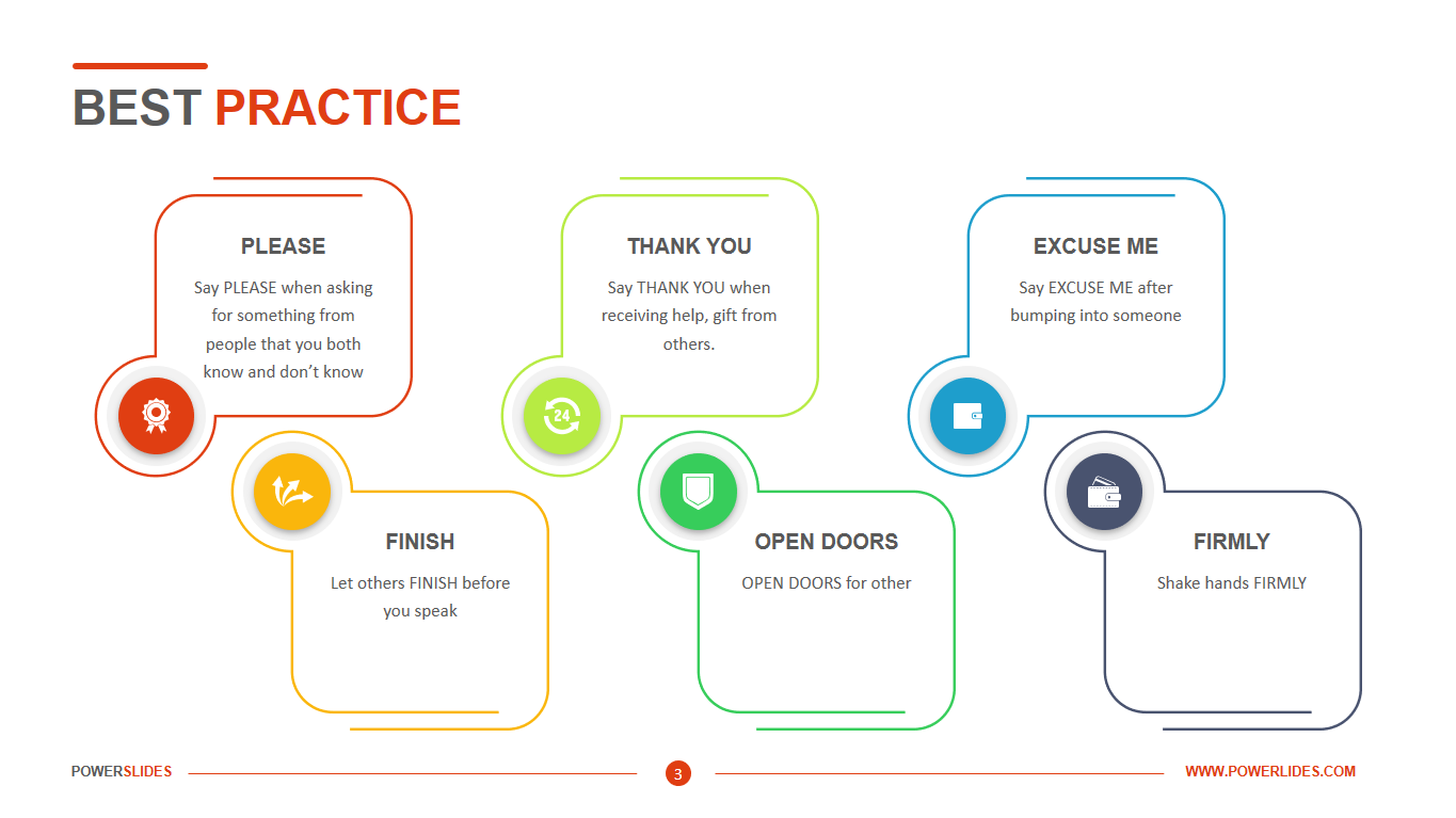
To ensure your presentation layouts are effective, consider the following best practices:
-
*Keep it Simple*: Avoid cluttering slides with excessive text. Aim for concise bullet points and limit the amount of information per slide to maintain focus and clarity.
-
*Use Visuals Wisely*: Incorporate high-quality images, charts, and infographics to complement your text. Visual aids can help clarify complex information and keep the audience engaged.
-
*Establish a Consistent Theme*: Use a cohesive color scheme, font style, and layout throughout your presentation. Consistency promotes professionalism and helps the audience follow your narrative.
-
Prioritize Readability: Ensure that text is large enough to be read from a distance. Use contrasting colors to enhance visibility and avoid distracting backgrounds.
-
Limit Transitions and Animations: While transitions can add flair, excessive animations can distract the audience. Use subtle animations to emphasize key points without overwhelming viewers.
-
Incorporate White Space: Allow for ample white space in your layouts to prevent overcrowding. This enhances readability and helps highlight important information.
-
Engage with Scaffolding Slides: Use agenda and recap slides to reorient the audience throughout the presentation, helping them stay focused on the main message.
-
Understand your audience’s needs
- Keep designs simple and uncluttered
- Use a consistent color scheme throughout
- Ensure proper alignment of elements
- Choose legible fonts and appropriate sizes
- Use white space effectively to enhance readability
- Test layouts on different devices and screens
Tips for Applying Layouts in Presentations
Start by outlining your content to organize your main points clearly. This will guide you in selecting the most fitting layout for each section of your presentation.
When choosing templates, look for pre-designed options that match the theme of your presentation. Customizing these templates to reflect your brand can enhance visual appeal and coherence.
Before you present, rehearse using the layouts to check their flow. Pay attention to how each slide transitions to the next and make adjustments as needed to ensure a smooth presentation.
It’s beneficial to seek feedback from colleagues or friends. They can provide constructive insights on how clear and engaging your layouts are, helping you refine them further.
Be prepared to adapt your layouts based on the needs of your audience and the context of your presentation. Being flexible can significantly improve the effectiveness of your delivery.
Using Visuals to Enhance Presentation Layouts
 Credits: slidemodel.com
Visuals are a powerful tool in presentations that can elevate your message and engage your audience. When applied thoughtfully, they can clarify complex ideas and make information more relatable. For instance, instead of listing statistics in text form, consider using a bar graph. This allows the audience to see comparisons at a glance, making the data more digestible.
Images can also evoke emotions and create connections with your audience. For example, if you’re presenting on climate change, a striking image of a melting glacier can have a far greater impact than text alone, prompting an emotional response that can lead to a deeper understanding of the issue.
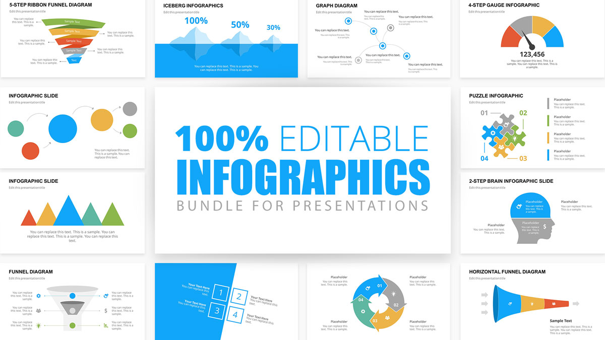
Incorporating infographics can also streamline information by combining text and visuals. This format is particularly useful for summarizing data or processes. For instance, instead of explaining a multi-step process in paragraphs, an infographic can visually depict each step, guiding the audience through the information more effectively.
It’s essential to ensure that visuals align with your content and enhance your message rather than distract from it. When you choose images, charts, or other visual elements, ask yourself: does this support the point I’m making? For example, using a photo of a product in a sales presentation can reinforce your message about its features and benefits.
Lastly, remember that less can be more. Using too many visuals can overwhelm your audience. Aim for a balance that maintains interest while ensuring clarity. A well-placed image or a single impactful chart can often convey more than multiple visuals cluttering a slide.
How to Choose the Right Template
Choosing the right template for your presentation is crucial for making a strong impact. Start by assessing the theme of your presentation. For example, if you are presenting a corporate report, opt for a professional-looking template with clean lines and subdued colors. On the other hand, a creative pitch might benefit from a more vibrant and dynamic template with engaging visuals.
Next, consider your audience. If you’re presenting to a board of directors, a minimalist template might be more appropriate, while a classroom setting could allow for more playful designs. Think about the content you’ll be sharing; templates with built-in data visualization tools can be very helpful for presentations heavy on statistics.
Also, ensure that the template you choose allows for easy customization. You may want to adjust colors, fonts, or layouts to better match your content and personal style. Test different templates to see which best supports your narrative flow and enhances clarity. Remember, the right template not only complements your content but also helps create a cohesive and professional presentation.
Engaging Your Audience with Scaffolding Slides
Scaffolding slides are a powerful tool in presentations, helping to guide your audience through the content. By using agenda and recap slides, you can reinforce the main ideas and keep everyone on track. For example, after discussing a key topic, a recap slide can summarize the main points, allowing the audience to reflect on what they’ve just learned. This technique is especially useful in longer presentations where it’s easy for the audience to lose focus.
Additionally, scaffolding slides can serve as signposts, indicating shifts in the presentation’s direction. An agenda slide at the start outlines what will be covered, giving the audience a roadmap of sorts. This approach not only enhances understanding but also builds anticipation for what’s next. It’s like offering a glimpse into the journey ahead, making the audience more engaged and prepared.
To make the most of scaffolding slides, keep them clear and visually appealing. Use bullet points or simple graphics to highlight key sections without overwhelming the audience with information. The goal is to create a seamless flow that allows your audience to absorb information effectively, ensuring they remain engaged throughout your presentation.
Testing and Rehearsing Your Presentation Layouts
When it comes to presenting, practice is just as important as design. Testing your layouts in advance helps you identify any issues with flow or clarity. As you rehearse, pay attention to how each slide transitions into the next. For instance, if you move from a data-heavy slide to a conclusion slide, ensure the key points are clear and easily digestible.
One effective way to test your presentation is by doing a trial run in front of a friend or colleague. Ask them for feedback on the layout and pacing. They might notice that a particular slide is too cluttered or that a visual doesn’t quite support your message. Their fresh perspective can be invaluable.
Additionally, consider the timing of each slide during your rehearsal. If a slide feels rushed or lingers too long, adjust it accordingly. Aim for a natural rhythm that keeps the audience engaged.
Finally, use technology to your advantage. Many presentation software options allow you to practice with presenter mode, showing you notes and slide previews. This feature can help you get comfortable with your layout and anticipate the audience’s reaction. By thoroughly testing and rehearsing your layouts, you’ll gain confidence and ensure a smoother delivery.
Gathering Feedback for Better Layouts
Feedback is a vital part of refining your presentation layouts. After creating your slides, consider sharing them with trusted colleagues or friends. Their fresh perspectives can reveal areas for improvement that you might overlook. For instance, they might point out slides that are too cluttered or suggest clearer visuals to enhance understanding. Additionally, ask specific questions about the layout’s clarity and engagement. This targeted feedback will help you identify strengths and weaknesses in your design. You can also conduct a small test presentation with a sample audience. Observe their reactions and ask for their thoughts afterward. This real-time feedback can be invaluable, providing insights into how well your layouts resonate with your intended audience. Remember, the goal is to create a presentation that not only informs but also captivates, and gathering feedback is a crucial step in achieving that.
Adapting Layouts for Different Audiences
Understanding your audience is key to delivering a successful presentation. Different groups may have varying preferences and expectations that can influence how your layout should be designed. For instance, when presenting to a technical audience, such as engineers or scientists, you may want to incorporate more data-heavy slides with detailed graphs and charts. This allows them to engage with the specifics and analyze the data critically. On the other hand, when addressing a general audience or stakeholders, it’s essential to simplify your layout. Use clear visuals and limit jargon to ensure everyone can follow the main ideas without getting lost in technical details.
Consider a business pitch to potential investors. Here, a clean and professional layout with concise bullet points highlighting key financials and growth projections is crucial. Investors are often looking for clarity on how their money will be used and the potential returns, so using layouts that make this information easily digestible is vital.
In educational settings, where students may have diverse learning styles, a mixed layout that combines text, images, and interactive elements can keep students engaged. Incorporating questions or prompts can encourage participation and make the information more relatable.
By tailoring your presentation layout to fit the audience’s expectations and understanding, you can enhance engagement and ensure that your message resonates.
Frequently Asked Questions
1. What types of layouts can I use in my presentation?
You can use various layouts such as title slides, bullet points, images, charts, and diagrams to effectively present your information.
2. How do I choose the right layout for my content?
Consider the type of information you have. Use bullet points for lists, images for visuals, and charts for data. The goal is to make your content clear and engaging.
3. Can I customize the suggested layouts to fit my needs?
Yes, you can customize layouts by changing colors, fonts, and positions of text and images to better suit your style and message.
4. What are the benefits of using suggested layouts in my presentation?
Using suggested layouts helps to organize your ideas clearly, saves time in design, and keeps your audience engaged with a professional appearance.
5. Is it possible to combine different layouts in one presentation?
Absolutely! Mixing different layouts can make your presentation more dynamic and appealing, just be sure to maintain a consistent theme throughout.
TL;DR Effective presentation layouts are crucial for clear communication and audience engagement. This article explores various layout types, best practices for design, and tips for application, including the importance of simplicity, visual aids, consistency, and adaptability. By following these strategies, presenters can create compelling presentations that resonate with their audience.


