Creating visually appealing graphs is crucial for effective presentations. Adobe Illustrator allows users to craft and customize various graph types seamlessly. To start, access the Graph Tool in the toolbar—just click and hold the icon to find options like Column, Bar, Line, and Pie graphs. After selecting a tool (for example, using J for Column), you can draw your graph and input data directly into a provided sheet. Styling comes next; ungroup elements to modify colors and textures for a professional touch. Remembering best practices such as simplicity in design, clear labeling, contrasting colors enhances clarity—ultimately making your presentation more engaging!
1. Accessing the Graph Tool in Illustrator
 Credits: youtube.com
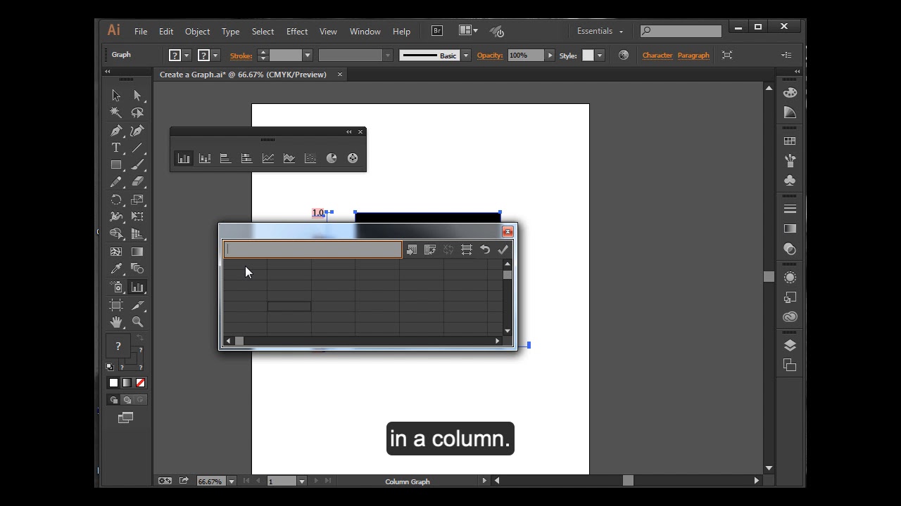
The Graph Tool can be found in the toolbar on the left side of your Illustrator workspace. By default, it shows the Column Graph Tool, but you can access various graph types by clicking and holding the icon. Options include Bar, Line, and Pie graphs. If you don’t see the tools, make sure to switch to the advanced toolbar by going to Window > Toolbars > Advanced. This is crucial for accessing all the graph options available to you. Familiarizing yourself with these tools is the first step toward creating effective visual representations of your data.
2. Step-by-Step Guide to Creating Graphs
 Credits: venngage.com
To create a graph in Adobe Illustrator, follow these steps carefully. First, select the appropriate graph tool from the toolbar. For instance, if you need a column graph, choose the Column Graph Tool. Click on the artboard to set the size of your graph. A data sheet will appear, prompting you to input your data. For example, if you’re showcasing sales data for different quarters, input the labels like ‘Q1’, ‘Q2’, ‘Q3’, and ‘Q4’ along with their respective figures.
Once your data is in, click ‘OK’ to generate the graph. If you wish to customize it further, select the graph and go to ‘Object > Ungroup’ to separate the graph elements. This allows you to change colors, add gradients, or even apply 3D effects for a more dynamic look.
For a pie graph, the process is similar. Select the Pie Graph Tool, enter your data, and then ungroup to customize each slice. If you’re creating a line graph, again select the Line Graph Tool, input your data to show trends, and customize as needed.
Throughout this process, remember that your goal is to make the graph not only informative but visually appealing, ensuring it enhances your overall presentation.
| Graph Type | Steps | Styling |
|---|---|---|
| Column Graph | 1. Select the Column Graph Tool 2. Draw the Graph 3. Input Data |
– Change colors – Add textures – Create 3D effects |
| Pie Graph | 1. Select the Pie Graph Tool 2. Input Data |
– Modify pie sections |
| Line Graph | 1. Select the Line Graph Tool 2. Input Data |
– Customize line styles – Adjust markers – Change colors |
3. Best Practices for Graph Design
 Credits: visme.co
Keeping your graph design simple is crucial. Avoid overcrowding with too much information; focus on the key data points that effectively convey your message. Using contrasting colors will help differentiate between various data sets, making it easier for your audience to read. Always label your axes clearly and ensure that data points are easily understandable. Incorporating legends where necessary can aid in clarity. Additionally, utilizing white space can greatly enhance readability, allowing your graph to stand out within your overall presentation design. For instance, if you’re presenting sales data, consider using only the most significant quarters and leaving out less impactful data to maintain focus.
- Use a clean and simple layout to avoid clutter
- Choose a color scheme that enhances readability
- Opt for legible fonts and appropriate sizes
- Ensure axes are labeled clearly and accurately
- Include a legend when necessary for clarity
- Utilize data markers to highlight important points
- Maintain consistent styles for similar data sets
- Test the graph in presentation mode for visibility
4. Advanced Tips and Techniques for Graphs
Combining Graphs: You can create dual-axis graphs to compare different data sets on the same graph. Select the data series, and use the Group Selection Tool to adjust the axes as needed. This technique is useful when you want to showcase relationships between two variables that have different scales. For example, you could compare revenue and expenses over the same time period, allowing your audience to see trends at a glance.
Importing Data from Excel: If you have your data organized in Excel, you can easily import it into Illustrator. Click on the Import Data button in the data sheet to bring in your Excel file. This feature saves you time and ensures accuracy, as you won’t have to manually enter large amounts of data. Just make sure your data is formatted correctly in Excel to prevent any import issues.
Understanding Limitations: While Illustrator is great for design, it has limitations regarding certain chart types (e.g., donut charts, high-low charts). These can sometimes be created in Excel and then edited in Illustrator. Knowing these limitations will help you choose the right tool for your graph creation process, ensuring you use Illustrator’s strengths to your advantage.
5. Troubleshooting Common Graph Issues
When working with graphs in Adobe Illustrator, you may encounter a few common issues that can hinder your design process. One frequent challenge is aligning graph elements properly after transformations. Illustrator treats graph objects differently from standard shapes, so when you resize or rotate them, the alignment can become skewed. To manage this, use guides or placeholders to ensure that everything lines up as you intend.
Another issue arises with data formatting. If you ungroup your graph to edit individual elements and later decide to update your data in the original data sheet, you might find that your custom styles revert to the original format. It’s a good practice to duplicate your graphs before making any significant changes to avoid losing your stylings.
Additionally, if your graph appears distorted or not displaying correctly, check the data input. Sometimes, errors in data entry can lead to unexpected graph shapes. Always double-check your numbers and categories. If you encounter issues with the graph not updating after making changes, ensure that the graph is selected and refresh the data view to see the latest updates.
Lastly, if you’re having trouble with the visibility of certain graph elements, like labels or legends, make sure that they are not hidden behind other elements. You can use the Layers panel to bring them to the front for better visibility.
6. Examples of Effective Graph Usage in Presentations
Using graphs effectively can greatly improve the clarity of your presentation. For instance, if you are presenting sales data across multiple quarters, a column graph is a strong choice. It allows your audience to quickly compare the sales figures for each quarter. By using contrasting colors for each column, you can highlight trends and make key points stand out.
Another example is a pie graph for market share analysis. This type of graph visually represents the proportion of different competitors in the market. By labeling each segment with percentages, your audience can easily grasp the distribution of market share at a glance.
For showing trends over time, a line graph is ideal. Suppose you want to demonstrate the growth of your company’s revenue over several years; a line graph will clearly illustrate that upward trend. By using markers for significant events, like product launches, you can add context that further engages your viewers.
Incorporating these examples into your presentations not only makes data more digestible but also keeps your audience engaged.
Frequently Asked Questions
1. What types of graphs can I create in Adobe Illustrator for my presentations?
You can create various types of graphs like bar graphs, line graphs, pie charts, and scatter plots in Adobe Illustrator.
2. How do I start making a graph in Adobe Illustrator?
To start making a graph, go to the toolbar, select the graph tool, and choose the type of graph you want to create.
3. Can I customize the colors and styles of my graph in Adobe Illustrator?
Yes, you can customize colors, fonts, and styles of your graph to match your presentation theme using the color and style options.
4. Is it easy to update the data in my Illustrator graphs?
Yes, you can easily update the data by clicking on the graph and entering new values in the data table that opens up.
5. Are there templates available for graphs in Adobe Illustrator?
Yes, Adobe Illustrator offers various templates for graphs that you can use to get started more quickly.
TL;DR Learn how to effectively use Adobe Illustrator’s graph tools for your presentations. Access the Graph Tool, follow a step-by-step guide to create column, pie, and line graphs, and apply best design practices like simplicity, color contrast, and clear labeling. Explore advanced tips like combining graphs and importing data from Excel, while troubleshooting common issues such as transformation challenges and data formatting. Create visually engaging graphs that enhance the clarity and appeal of your presentations.

