Posters stand as a potent means of communication, whether at academic conferences or for advertising an event. A well-crafted poster combines creativity with sound design principles. To kick off, it’s crucial to establish the poster’s purpose—be it to inform or entertain—because this informs your design decisions. Readability is paramount; major elements must be legible from afar through a clear text hierarchy. Moreover, visual flow should guide the audience’s gaze naturally. Finally, strategic use of color and font selection can enhance your message without overwhelming it, making your information accessible and engaging. Careful attention leads to impactful designs that resonate effectively with viewers.
1. Understanding the Purpose of Your Poster
Before you begin designing your poster, it is crucial to define its purpose. Ask yourself, what do you want to achieve with this poster? Is it meant to inform the audience about a specific topic, persuade them to take action, or simply entertain? Knowing the primary objective will help shape your design and messaging.
Consider who your target audience is. Understanding their interests, preferences, and level of knowledge about the subject will guide you in crafting a message that resonates with them. For example, a poster aimed at academics will differ significantly in tone and content from one designed for a local community event. The language, visuals, and overall approach should align with the audience’s expectations and needs.
Additionally, think about the context in which the poster will be displayed. Will it be in a busy conference hall, a quiet library, or an outdoor festival? The environment can affect how your poster is perceived, including factors like visibility and engagement. By clearly defining the purpose and audience, you set the foundation for a poster that effectively communicates your intended message.
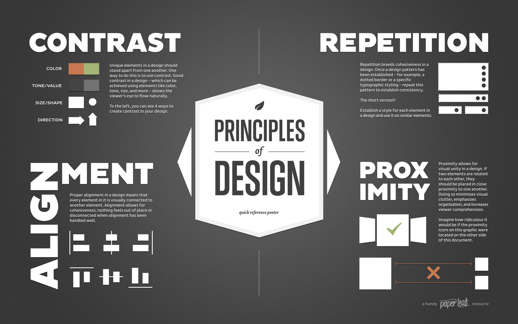
2. Essential Principles of Effective Poster Design
 Credits: paper-leaf.com
Readability is key to an effective poster. Ensure that the most important information is easily readable from a distance. Use a clear text hierarchy: the title should be the largest (88-120 pt for print), followed by authors and affiliations (70-90 pt), headings (54-80 pt), and body text (36-52 pt). This way, viewers can quickly grasp the main topics.
Visual hierarchy helps create a flow that guides the viewer’s eye. Organize content from top to bottom and left to right, making it easy for audiences to follow your message.
Balance and spacing are crucial for an aesthetically pleasing layout. Mix text, images, and white space effectively to avoid clutter. Leave margins of about 1 inch and use white space to enhance readability, making sure every element has room to breathe.
Alignment contributes to a clean, organized appearance. Align text, headings, and graphics consistently, which helps maintain a structured layout that is easy for viewers to navigate.
It’s also important to be contextually aware. Design with the display environment in mind. Consider background colors and surrounding elements to ensure your poster stands out and is easily visible.
| Element | Recommended Size | Description |
|---|---|---|
| Title | 88-120 pt | Should be the largest text on the poster. |
| Authors and Affiliations | 70-90 pt | Next largest after the title. |
| Headings | 54-80 pt | For major sections of content. |
| Body Text | 36-52 pt | For detailed information. |
| Margins | 1 inch | Recommended to create whitespace. |
| Images and Graphics | High Quality | Should support and enhance the message. |
3. Typography Choices for Your Poster
Choosing the right typography for your poster is crucial for effective communication. Start by selecting fonts that are easy to read from a distance. Sans serif fonts like Arial or Helvetica are great choices for their clarity, especially in digital and print formats. If you opt for serif fonts like Times New Roman, make sure they are legible and don’t compromise readability.
Consistency in typography is key. Stick to one or two fonts throughout your poster. Using distinct styles for headings and body text helps to create a visual hierarchy that guides the reader’s attention. For example, you might use a bold sans serif font for the title and a lighter version for the body text.
Color plays a significant role in typography as well. Ensure that the colors of your text complement the overall design and evoke the right emotions. Using one or two accent colors can enhance the visual appeal without overwhelming the viewer. For instance, if your poster has a blue background, white or light yellow text can create a strong contrast and improve readability.
- Choose font styles that reflect the poster’s theme
- Ensure readability from a distance
- Limit the number of font types used
- Use hierarchy to emphasize key messages
- Consider font size for headlines, subheadlines, and body text
- Stay consistent with spacing and alignment
- Test fonts in different sizes and formats before finalizing
4. Effective Design Layout Techniques
A well-structured layout is essential for guiding viewers through your poster effectively. Start with a prominent banner at the top that includes the title, authors, and affiliations. This sets the tone and establishes the focus of the poster.
Organizing content into columns is another effective technique. Aim for three to four columns to create a logical flow of information. Each section should have clear headings that help viewers navigate the content quickly.
Use headings and subheadings to break the poster into distinct sections. This not only enhances readability but also allows viewers to find specific information at a glance. For example, use bold headings for major sections like ‘Methods’ or ‘Results’ and smaller subheadings for detailed points.
Incorporating images and graphics is crucial. Select high-quality visuals that complement the text and add value to your message. For instance, a chart illustrating data can convey complex information quickly and effectively. Ensure that visuals are placed strategically within the layout to enhance the overall message without overwhelming the viewer.
5. Incorporating a Clear Call to Action
 Credits: adespresso.com
Including a clear call to action (CTA) in your poster design is essential for driving engagement and motivating viewers to take the next step. A well-crafted CTA serves as a guide for your audience, directing them on what to do after they’ve absorbed the information presented. Whether your goal is to inform, persuade, or inspire action, the CTA should be straightforward and compelling.
For instance, if you are promoting a conference, a CTA could be ‘Register Now for Early Bird Discounts!’ This not only creates urgency but also provides a direct instruction. Similarly, if your poster is about a product launch, a CTA like ‘Visit Our Website for Exclusive Offers!’ invites viewers to take immediate action.
The placement of the CTA is also crucial; it should be positioned where it naturally fits within the flow of the poster, ideally towards the bottom or at a focal point where viewers’ eyes are likely to land. Additionally, using contrasting colors or bold fonts can make your CTA stand out, ensuring that it catches the viewer’s attention. Remember, a well-defined CTA can significantly enhance the effectiveness of your poster by turning passive viewers into active participants.
6. Final Touches Before Displaying Your Poster
Before you print or display your poster, take a moment to finalize your design with a few essential checks. First, thoroughly review the content for any grammatical errors or typos. Even small mistakes can undermine your credibility, so it’s crucial to ensure clarity and professionalism. Next, check that all elements are aligned correctly and that there is a good balance between text, images, and white space. An unbalanced layout can distract viewers from your message.
Seek feedback from peers or colleagues who can provide fresh perspectives. They might spot areas for improvement that you overlooked. Additionally, consider the viewing distance; ensure that key information is still legible from afar. If possible, print a smaller version of your poster to see how it appears in real life, making adjustments as necessary. Lastly, ensure that the colors are consistent and vibrant, as they can significantly impact the poster’s overall appeal. By attending to these final touches, you can enhance the effectiveness of your poster and leave a lasting impression on your audience.
7. Examples of Effective Poster Designs
 Credits: venngage.com
Effective poster designs come in various forms, each tailored to specific purposes and audiences. For instance, a vibrant event poster promoting a music festival might use bold colors and large images of the performing artists to grab attention. The typography would be playful, matching the energetic vibe of the event, while key details like dates and ticket information are clearly highlighted.
In contrast, an academic poster presenting research findings often employs a more subdued color palette and a structured layout. It may feature bullet points to summarize key data, alongside graphs and charts that visually represent the research. This design approach allows viewers to quickly grasp complex information without feeling overwhelmed.
Another example is a public health campaign poster that uses infographics to convey important messages about vaccination. By combining simple icons, concise text, and a clear call to action, these posters effectively communicate health information to diverse populations.
Each of these examples demonstrates how effective posters can vary greatly in style and approach, yet all share a common goal: to convey information clearly and attractively.
8. Tools and Resources for Poster Design
Creating an effective poster requires the right tools and resources to bring your vision to life. Here are some popular options that cater to various design needs:
-
Adobe Creative Suite: Adobe Illustrator and Photoshop are industry standards for graphic design. They offer powerful features for creating detailed and high-quality posters, with extensive options for typography, color, and layout.
-
Canva: A user-friendly online design platform, Canva provides templates specifically for posters. It’s great for beginners and allows for easy customization with drag-and-drop features.
-
Microsoft PowerPoint: Often overlooked, PowerPoint can be an effective tool for poster design. It allows users to create large canvases, incorporate visuals easily, and export designs as images or PDFs.
-
Inkscape: This free, open-source vector graphics editor is a solid alternative to Adobe Illustrator. It’s suitable for creating high-quality graphics and is highly customizable.
-
Piktochart: Ideal for those focusing on infographics, Piktochart offers templates for posters that emphasize visual data representation, making it easier to communicate complex information clearly.
-
Visme: This tool combines design and presentation features, allowing users to create engaging posters with animations and interactive elements, perfect for digital displays.
-
Stock Photo Websites: Websites like Unsplash or Pexels provide high-quality images that can enhance your poster’s visual appeal. Always ensure to check the licensing agreements to use images legally.
-
Font Resources: Google Fonts and DaFont are excellent sources for diverse typography options. Choosing the right font can significantly impact your poster’s readability and overall aesthetic.
Using these tools effectively can streamline your design process, allowing you to focus on creativity while ensuring your poster looks professional and polished.
Frequently Asked Questions
1. What are the key elements of a good poster design?
A good poster design includes a catchy headline, clear visuals, engaging colors, concise text, and a strong call to action.
2. How important is color in poster design?
Color is very important as it can grab attention, set the mood, and communicate the message more effectively. Choosing the right color scheme is key.
3. What size should a poster be for maximum impact?
The size of your poster can depend on where it will be displayed, but common sizes include A3 and A2. Larger sizes can stand out more but consider the viewing distance.
4. How do I choose the right fonts for my poster?
Choose fonts that are easy to read from a distance and match the tone of your message. It’s best to use no more than two or three different fonts.
5. What tips can help me create a unique poster design?
To create a unique poster, focus on originality in your graphics, use unexpected color combinations, and ensure your message stands out by being clear and creative.
TL;DR This handbook outlines the key elements for effective poster design, including understanding your poster’s purpose, prioritizing readability and visual hierarchy, selecting appropriate typography, and using a well-structured layout. Incorporate a clear call to action and make final touches before displaying. Examples of successful posters highlight the importance of creativity balanced with design principles.

